What is web design?
Web design is the process of creating visually appealing, functional websites that meet the needs of businesses and their audiences. It brings together a range of disciplines — graphic design, user experience (UX) design, interface design, and search engine optimisation — into a single, cohesive product.
A good web design process starts with understanding the client’s goals, their target audience, and the content the site needs to carry. From there, designers move through wireframing, visual design, and refinement before handing off to development.
Wireframing and mockups
The first step in most design projects is creating a wireframe — a basic structural layout that maps out each page without visual styling. Once the structure is approved, designers layer in color, typography, imagery, and other visual elements to produce a high-fidelity mockup.
Usability and accessibility
A visually appealing site that’s hard to use is a failed site. Web designers need to ensure clear navigation, appropriate typography, readable font sizes, and accessibility for users with disabilities. These aren’t optional extras — they’re core to good design.
SEO and performance
Design decisions directly affect search engine performance. Page structure, image optimisation, load speed, and mobile-friendliness all influence how search engines rank a site. Good web design accounts for these factors from the start.
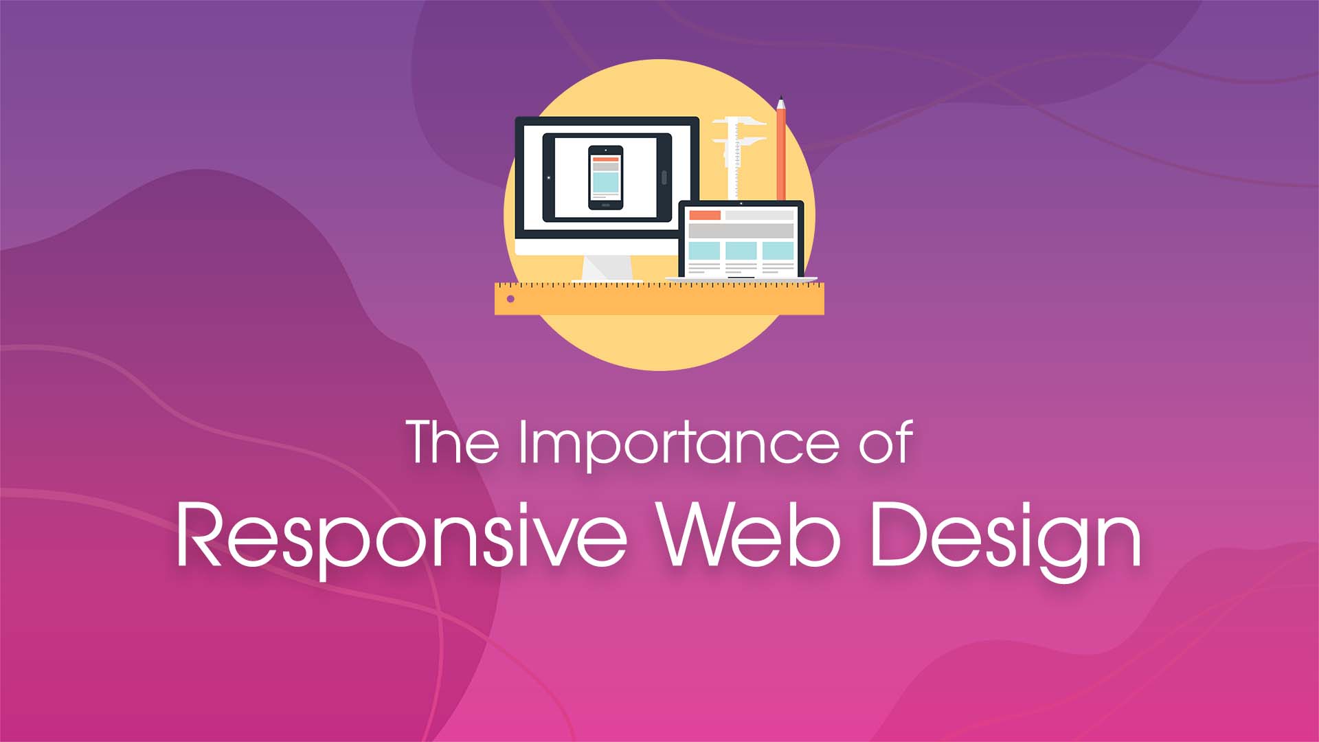
What is responsive web design?
Responsive web design is an approach that ensures a website adapts its layout, images, and content to fit the screen size of whatever device is being used — whether that’s a desktop monitor, a laptop, a tablet, or a smartphone.
Rather than building separate sites for desktop and mobile, a responsive site uses flexible grids, fluid images, and CSS media queries to reflow content automatically. The result is a single codebase that works well everywhere.
Why responsive web design matters
As of 2025, mobile devices account for roughly 60% of global web traffic. Google completed its shift to mobile-first indexing, meaning it now uses the mobile version of your site as the primary basis for ranking and indexing. If your site doesn’t work well on mobile, it doesn’t rank well — full stop.
Here’s why responsive design is essential:
Improved user experience
A responsive website gives users a consistent, comfortable experience regardless of the device they’re on. They can read content, navigate menus, and complete actions without pinching, zooming, or scrolling sideways. This directly reduces bounce rates and increases time on site.
Higher search engine rankings
Google explicitly recommends responsive web design as the preferred approach for mobile-friendly sites. A responsive site is easier for Googlebot to crawl, avoids duplicate content issues that come with separate mobile URLs, and signals to search engines that the site is well-maintained.
Lower development and maintenance costs
Maintaining two separate sites — one for desktop, one for mobile — doubles the work. A single responsive site means one codebase, one set of content updates, and one SEO strategy. Over time, this saves significant time and money.
Future-proofing
New screen sizes and device types appear regularly. A well-built responsive site adapts to these changes without requiring a full redesign. Flexible layouts and relative units mean your site stays usable as the device landscape evolves.
Tips for building a responsive website
If you’re building or redesigning a site, here’s what to keep in mind:
- Start mobile-first. Design for the smallest screen first, then scale up. This forces you to prioritise what matters and results in leaner, faster sites.
- Use a responsive framework. Tools like Tailwind CSS and Bootstrap provide solid responsive foundations and save significant development time. Tailwind CSS in particular has become the dominant choice for modern projects.
- Use fluid grids and relative units. Avoid fixed pixel widths. Use percentages,
em,rem, and CSS Grid or Flexbox to create layouts that flex naturally. - Optimise images. Use modern formats like WebP, serve appropriately sized images for each screen size, and use lazy loading to avoid unnecessary data transfer on mobile.
- Test across real devices. Browser developer tools are useful, but nothing replaces testing on actual phones and tablets. Pay attention to touch targets, font sizes, and form usability.
- Prioritise page speed. Mobile connections are often slower than desktop. Compress assets, minimise render-blocking scripts, and aim for strong Core Web Vitals scores.
Responsive web design isn’t a trend — it’s the baseline expectation for any professional website in 2025. Getting it right means better rankings, happier users, and a site that holds up as technology continues to change.